


Name: TOKYO DOME CITY
Type: Custom typeface
Client and creative direction: &Form
Release year: 2023
Tokyo Dome is home to the Tokyo Yomiuri Giants, one of the most prestigious baseball teams in Japan. It is surrounded by a theme park, swimming pool, spa, and hotel, collectively branded as Tokyo Dome City (henceforth TDC). Having built up the variety of facilities over the decades and feeling a bit too familiar, and only a logotype to support the visual communication, TDC was due for a new element of excitement. &Form, the branding agency in Tokyo, initiated the new brand identity project and commissioned a variable Latin typeface as its main portion. It was intended to make use of the digital displays in a variety of dimensions, the widest being 120 metres.
The brief was a clean, modern, and punchy display typeface. And since TDC is an entertainment premise, we wanted it to have element of fun. Based on that, we decided to make a casual display sans. It would be tightly spaced, occasionally low-waisted, and would have curved diagonas and ink traps, or what I prefer to call negative serifs.
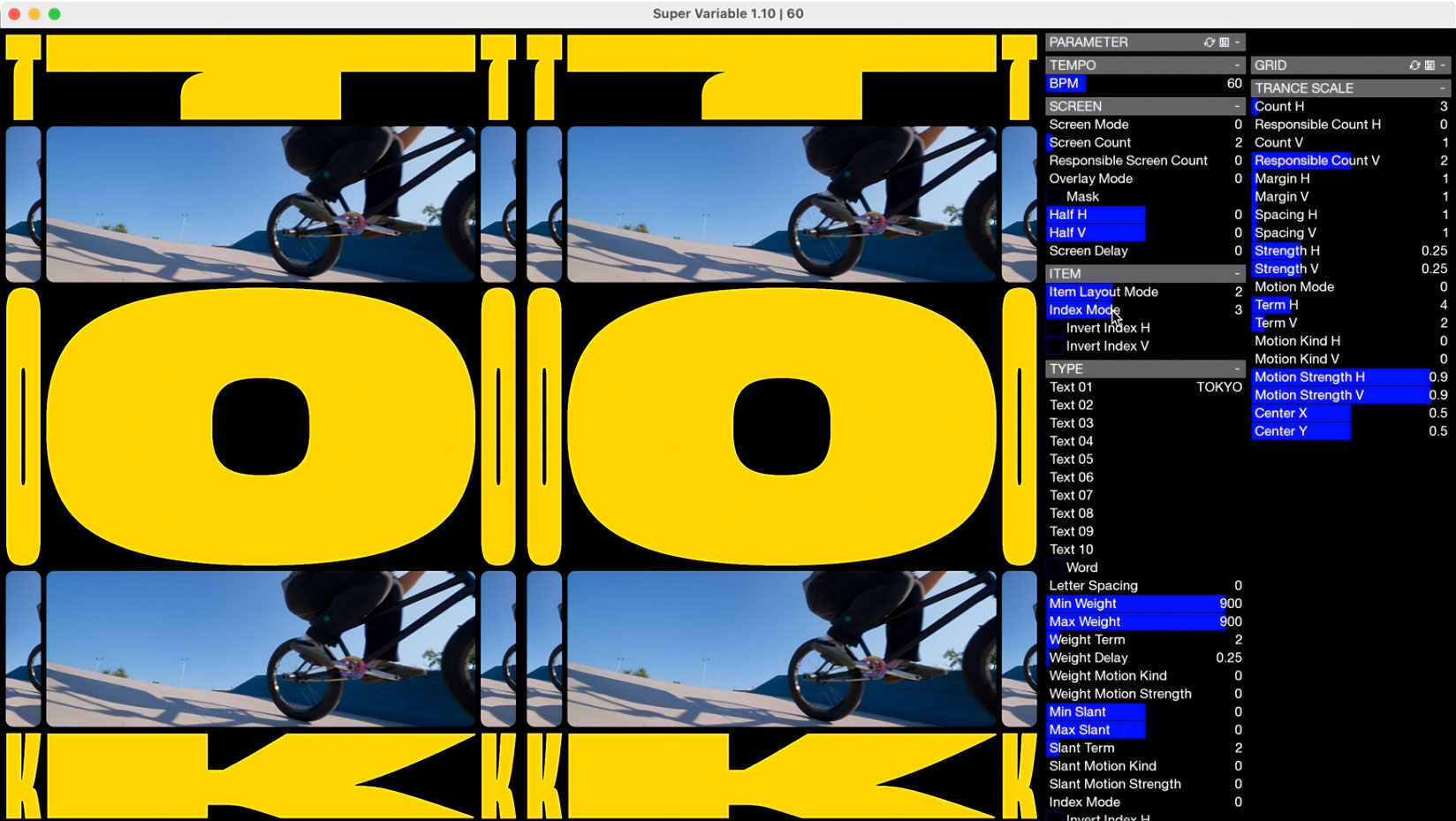
The element of variable font was a particularly important one. It was intended to make use of the newly installed digital displays in a variety of dimensions, the longest being 120 metres. We decided to stick with monospaced metrics and only capitals to keep the project controllable. The typeface was to have weight and width axes at the start, but eventually height and slant axes too.
- The weight axis would start from 10 units of stroke thickness (1% of font size) until it fills the glyph body, using four masters in total.
- The width axis originally started rather modestly in hindsight, and we ended up from 100 units all the way to 7500; 5 masters in the axis.
- The next was a rather unusual height axis; if you want to make the glyph taller while keeping the width, you may think it could be achieved by increasing the font size while decreasing the width value, which in reality animated in a jitterly fashion. We therefore decided to add height axis that supports up to 4000 units; 3 masters.
- The last is a mechanical slant axis which could be achieved in other ways in certain applications like Adobe CC, but &Form was developing a custom application, and it was more convenient if the font had a slant axis. This axis was populated automatically by scripting, adding -45° and 45° slants; therefore 3 masters including the upright.
That gives a total of 180 masters. I needed to think ahead to maintain good results in as many areas of the design space as possible, and the stylistic choices were made based on the feasibility in extreme cases while keeping visual identity.
The extremely wide range of flexibility was put to great use with the use of the bespoke app developed for the project; otherwise, existing apps like After Effects or browsers wouldn't be up for the job. The backbone of the system, as seen below, was developed by &Form while the delivered app for the client was developed by Aircode. You can see more of it in action on &Form's project page.
This level of typographic exploration is still uncommon in branding which favour tighter control, and I was incredibly fortunate to partner with a client who was able and happy to break new grounds.